
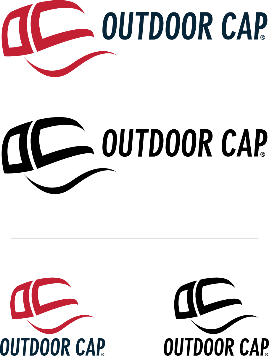
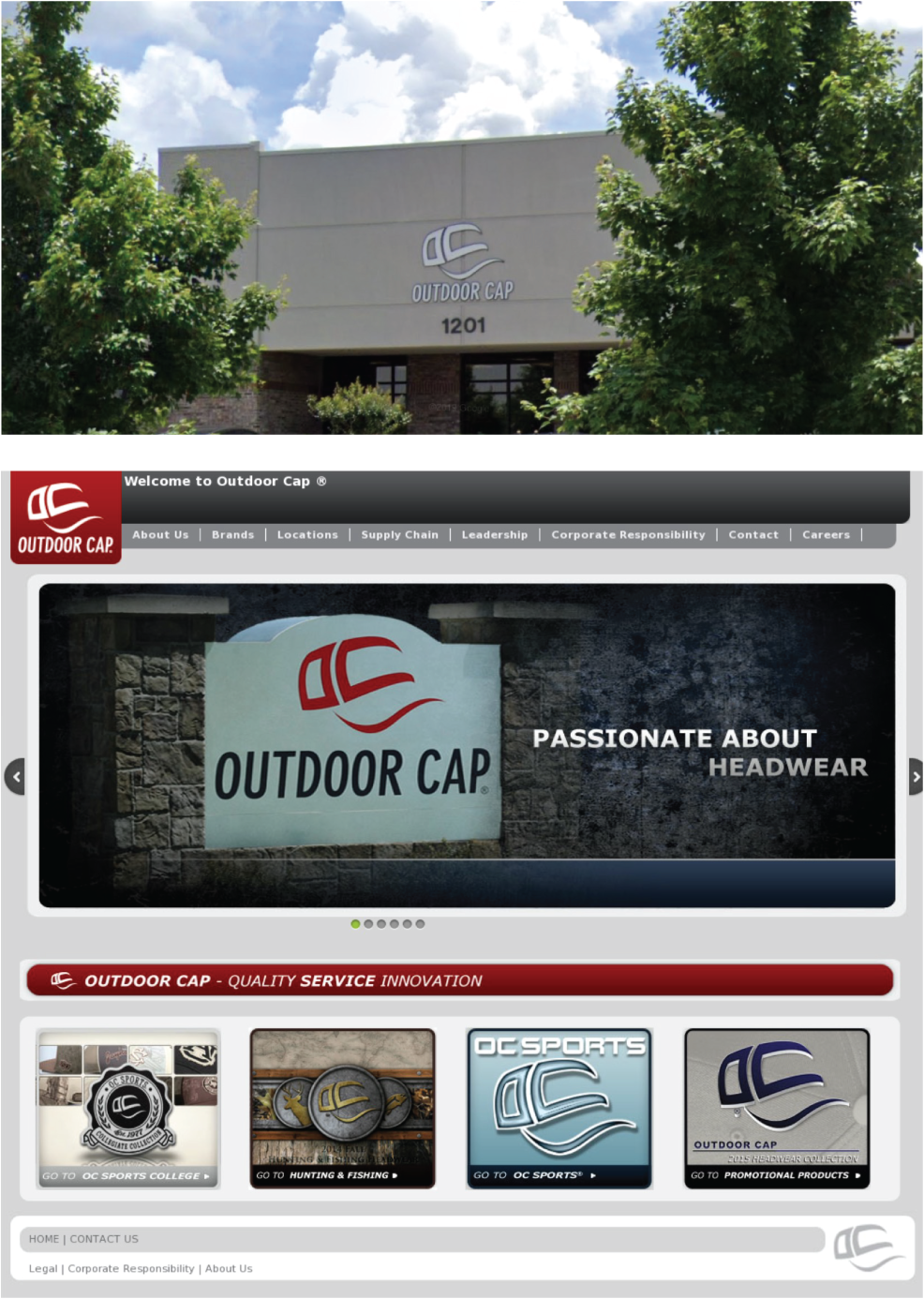
Current primary brand mark.
Under direction of Design Manager, the final logo lock-up with wordmark was achieved in collaboration with additional feedback from corporate leadership.
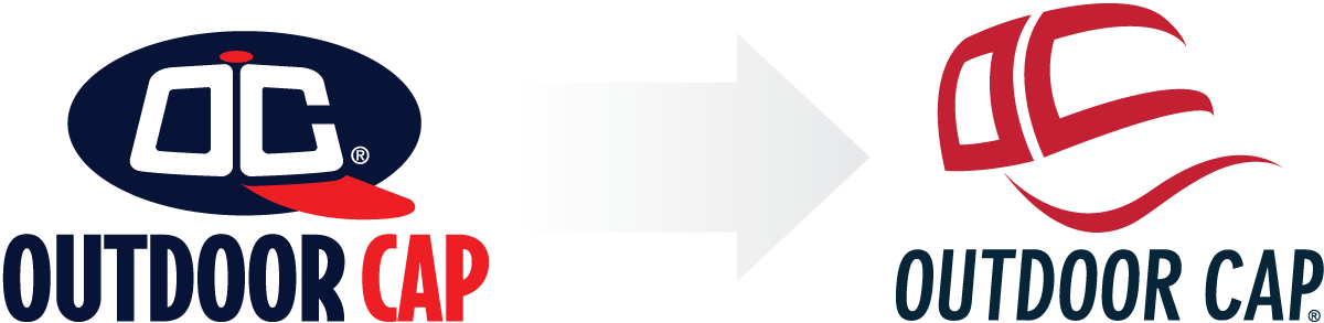
The corporate brand update shows a natural evolution from its predecessor, maintaining conceptual elements, such as a new variation of the 'OC' crown and visor. Color palette was preserved in a similar red/white/blue combination per wishes of the founder.
As many other successful brands within the competitive landscape, the logo portrays a sense of movement while maintaining Outdoor Cap's identity and image of its specialization.
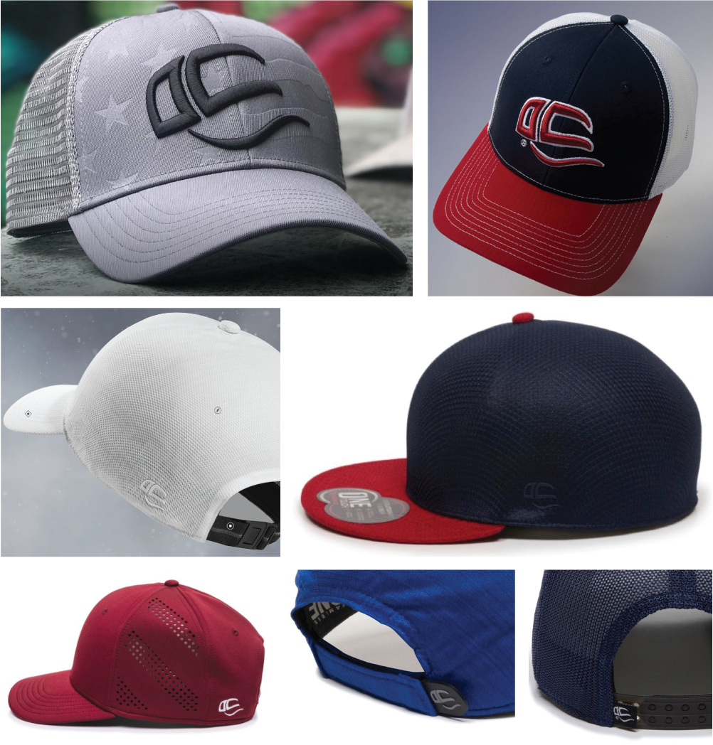
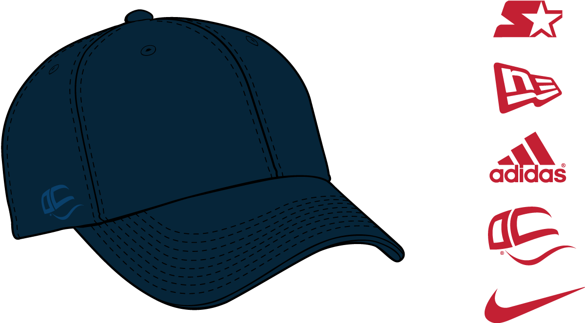
Examples of the logo's versatility across corporate and product branding.
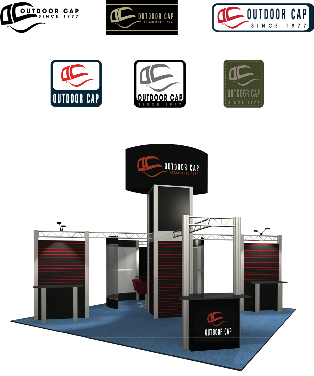
Initial conceptual process of logo variations, labeling and trade show booth mockup.
Images © Outdoor Cap Co., Inc.